It’s true there are no hard and fast rules for what constitutes a best-selling travel image, but there are a few key things that will appeal to editors and other photo-buyers–especially if you’re looking at selling photos to magazines and newspapers. Here are a few examples…
1. Think outside the leaf
Yankee has been covering New England autumn since our start in 1935. We’ve probably seen more foliage-related images than anyone.
Too often, though, photographers reduce the season to just the leaves. Really, it’s just one aspect of it. Stonewalls, dirt roads, apple orchards, and autumn festivals beautifully represent the season, too.
When shooting a season—any season—expand your horizons to things that aren’t so obvious. Editors yearn to see a familiar story or idea in a new way. You’ll earn their attention if can deliver that to them.
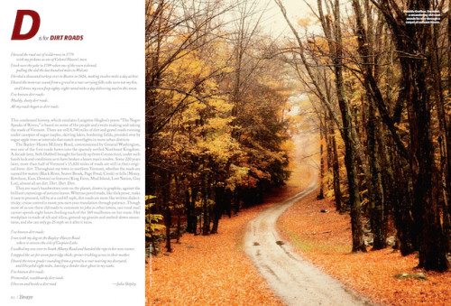
This image, below, was taken just outside Grafton, Vermont, and ran in Yankee’s September/October 2012 issue. It certainly packs color, but the foliage is almost secondary.
The core of the image is a lovely dirt road that meanders through the woods. It’s cast in a soft light that makes you want to follow this country lane right to its end point.
2. Skip the high-school photo
People shots are so important in travel stories. But getting good ones can be difficult. Time may be short; the space you’re shooting in cramped. The end result is often a series of shots of people looking straight at the camera with that “I’m getting my picture taken” expression on their face.
That doesn’t work for anybody, especially your editor. Instead, have your subject look away from the camera. Loosen them up before you shoot—know any good jokes?—so they forget the camera is even there.
Or, try to capture a genuine moment between them and another person. It may require some extra time, but the payoff will be worth it.
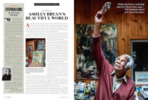
The main image on this spread, of children’s book illustrator and educator, Ashley Bryan, was published in our September/October 2013 issue and is one my favorite recent portraits that we’ve run.
Its beauty comes from its simplicity. Bryan holds in his hand a stained-glass sculptor made by one of his students. It’s like he’s looking at the artifact for the first time and the camera captures the gentle, strong features of this well-loved artist.
As a result, we see so much more about the man than we would have if the photographer had simply shot him straight on.
3. Details, details, details
Remember, you’re a storyteller, so it’s imperative that you think like one as you make your images.
There will be the obvious photos not to miss—that killer landscape or a famous dining room—but it’s also important to think of the small but important detail photos that will bring more of your story to life.
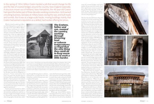
A historic photo that hangs on a restaurant’s wall, for example, or a design detail of a furniture-maker’s table. These images probably won’t run large, but any good art director will appreciate having them available for their layout.
Quick tip: You’ll earn the kudos of your editor with good caption info. Go beyond providing general identification and reach for something more revealing about the story you’re trying to tell.
Maybe it’s a good quote or an interesting historical factoid. The top three images ran in a story about a covered bridge restorer that was published in Yankee’s September/October 2013 issue. They aren’t the lead images but they do offer additional insight into the builder’s craft and his historical significance.
Note: A photo contest is a great way to experiment with your camera, test the water, and apply these techniques. Read how Valerie one the 2016 Photo Challenge Grand Prize with her photo series.
[Editor’s Note: Learn more about how you can fund your travels and make an extra income with photography, travel writing, blogging, and more in our free online newsletter The Right Way to Travel. Sign up here today and we’ll send you a new report, Profit From Your Photos: A Quick-Start Guide, completely FREE.]


