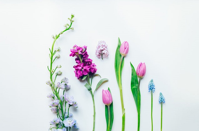
Check out these four photos below.
Can you tell what they all have in common?

The answer is: Copy space.
While each of the photos above show completely different subjects, they all use copy space very well, and that is what makes them so successful as stock photography.
Copy space simply means empty space that is left in a photo—space that leaves room for a designer to overlay text. It really is as simple as it sounds. And the beauty is that simple sells.
When it comes to stock photography, one of the best ways to increase your photo sales is to start leaving room in some of your photos as you compose. It will help to make your photos more attractive to buyers (particularly designers).
Here are a few ideas for using copy space as a compositional technique:
Look for blank walls. Any time you find empty walls, you should be thinking copy space. Don’t be afraid to place your subject(s) off to the side to leave room. It might seem a little weird at first to compose this way, but just imagine text overlaid in the empty space, and it will start to make more sense, visually.

Be conceptual. Page through any magazine and you’ll likely see advertisements that use conceptual photos along with negative space to support their message. With these types of photos, you are literally providing a visual aid to help give their words impact. For example, the photo below could be used across a wide range of industries to illustrate the concepts of leadership, bright ideas, and innovation.

Observe and isolate. Anytime you can frame your subject against a solid background, you’ve got the perfect situation for creating copy space. Water, sky, and grass all make excellent backgrounds for this purpose.

Change your angle. If you’re having trouble creating negative space in your composition, try changing your angle. You might need to get down lower, like in the photo below.

Another approach is to point your camera down from above. This “flat lay” style of composition is very popular and also perfect for creating copy space. It’s easy to set up an arrangement of props at home, leaving a bit of space as you compose. I tried this out with a bouquet of flowers, which I arranged on a sheet of white paper on the floor, leaving room at the top for text. This series of images has become one of my better sellers as stock photography.

Watch your edges. Last but not least, be certain that nothing distracting is sneaking in along the edges of your frame. After you take a photo, do a quick review of the shot to make sure your edges are clean.
So often, less is more when it comes to photography, so don’t be afraid to leave a bit of breathing room in your photos, especially if you plan to sell them as stock.
[Editor’s Note: Learn more about how you can fund your travels and make an extra income with photography, travel writing, blogging, and more in our free online newsletter The Right Way to Travel. Sign up here today and we’ll send you a new report, Five Fun Ways To Get Paid To Travel: A Quick-Start Guide, completely FREE.]


