This month’s photo challenge theme is “Paint the Town Red.” And by the looks of it, that is exactly what’s happening. Take a look at this image … 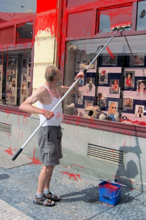 Good composition is a key ingredient in a saleable photograph. And using The Rule of Thirds is one of the first tricks new photographers learn. The idea is simple: When you look through your viewfinder, imagine a tic-tac-toe grid that divides the image into thirds from top to bottom and left to right. You want to place your subject on or close to one of the four intersections rather than smack dab in the center. This photo does a nice job of that…
 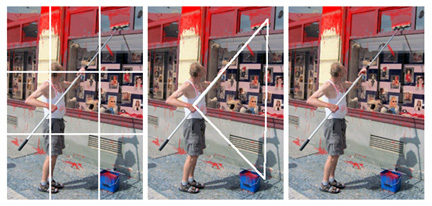 Notice the three quarter grid set up on the image to the left. See how the man is lined up perfectly on the left line? Notice, also, how this image has strong points of interest in both the top right and bottom right sections — it creates an almost visible triangle that keeps the eye of the viewer traveling in the picture (another good compositional element). Very nicely done. Now take a look at this shot and see if we can’t improve it using the Rule of Thirds, which we just talked about with the first picture…
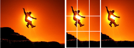
  I love this shot for its perfect timing and good stop action. The only thing I would suggest to make this a stronger image would be to take the subject out of the center and use the Rule of Thirds. This can be done horizontally or vertically, but in this case I think the action of the person’s body lends itself more to the vertical format. Take a look…
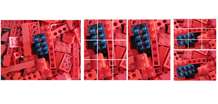
  Same with this next shot. The Rule of Thirds can be used in all types of photography — from portraits to abstracts. Take this photo here. The photographer has made good use of color, texture, and pattern. By off-setting all that red with the black Lego, the photographer employs a great technique we call Patterns Interrupted. Patterns, in general, make for very interesting photographs and great fine art prints. But sometimes, an interruption in the patterns — one broken picket in a picket fence or this black Lego here surrounded by all the red — makes your image much more unique. That said, you could improve this image by using the Rule of Thirds, getting in a little bit tighter,and eliminating the empty or gray spaces on the left. And you could improve it further by taking the black Lego out of the center and placing it on a three-quarter line. With this shot, that works well both vertically and horizontally. I think I’d opt to put the black Lego on the bottom third of the horizontal. That’s because it is a “stronger” color, and so, when placed near the bottom of the frame, it gives a feeling of support or foundation for the rest of the image. See what you think…
  This month, folks have submitted quiet a few sunset shots for our contest, like this one…
 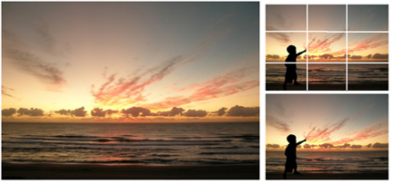 Sunsets must be one of those things that most people love to shoot. I know I take my share of them. There is something so magical and inspiring about sunsets — like a snow flake, no two are alike and they change by the moment. They can be hard to resist. But with so many of us shooting sunsets, you’ll have to make a special effort to capture images that set your sunsets apart from others. How? One way is to include “supporting elements” that are well-placed (hint — think about using the Rule of Thirds). Notice in the shot above how adding the silhouette of the little boy (with his forefinger pointing right on the one-third line) dramatically changes the dynamic interest of this sunset. Suddenly we have human interest — and this shot goes from being another pretty sunset to being a lifestyle shot somebody could hang on the wall in the family room or a stock shot that could illustrate a variety of topics. That’s it for this week’s photo tip. Keep it in mind as you’re shooting. [Editor’s Note: Learn more about how you can turn your pictures into cash in our free online newsletter The Right Way to Travel. Sign up here today and we’ll send you a new report, Selling Photos for Cash: A Quick-Start Guide, completely FREE.]
Get 3 Fun Ways to Get Paid to Travel!
Imagine yourself on the trip of your dreams: a palm-ringed island, the beauty and the history of Paris, the intoxicating allure of the Napa Valley. Now imagine that with only a pen, a camera and a little curiosity, all of these incredible travel destinations are within your reach.
Sign up today for our free newsletter, The Right Way to Travel, and you’ll learn how to get the most out of every trip – and how to get paid to do it.
Simply enter your name and email address in the form below and you’ll receive your first issue, along with our Three Fun Ways to Get Paid to Travel quick-start guide, absolutely free. Inside, you’ll find 3 exciting opportunities for earning extra income while exploring cities around the globe. It’s your first step to a life of fun and freedom.
Fill out the form today and you’ll be one step closer to a new part- or full-time income that can help you realize your travel dreams. And don’t worry – we will never rent, sell or give away your email address for any reason. We’ll see you out there!


